How to choose the best fonts for your packaging?
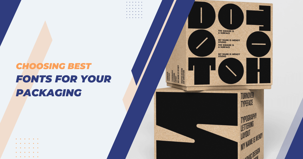
In the fast-paced world of promoting and showcasing products, the importance of how things are wrapped up is really big. People usually don’t realize enough how the kind of writing style used in packaging design plays a crucial role.
Fonts play a crucial role in conveying brand identity, establishing visual hierarchy and enhancing overall aesthetics. The right font can evoke specific emotions, communicate the brand’s personality and contribute to the overall success of a product.
Choosing Best Fonts For Your Packaging
Whether you’re a seasoned designer or a business owner involved in packaging decisions, understanding the nuances of font selection can elevate your product’s visual appeal and leave a lasting impression on consumers.
This guide aims to unravel the art of selecting the best fonts for packaging, providing insights into the factors to consider, trends to watch and tips for creating a visually compelling and impactful packaging design that resonates with your target audience.
- Consider your target audience: The first step in choosing the right font for your packaging is understanding who you are trying to reach. Different age groups, cultures and demographics respond differently to fonts. For example, a bold and modern font may appeal to younger audiences while a more traditional font might be appealing to older generations.
- Reflect on your brand’s personality: Your packaging design is an extension of your brand and should reflect its personality. The font you choose should align with your brand’s values, tone and voice. For instance, a playful and whimsical font can work well for a children’s product but may not be suitable for a luxury brand.
- Ensure readability: While it’s important to select an eye-catching font, it should also be easily readable. Avoid overly decorative fonts or ones with thin strokes that can be difficult to read at smaller sizes. Your packaging should convey important information about the product and a font that is too elaborate may hinder this.
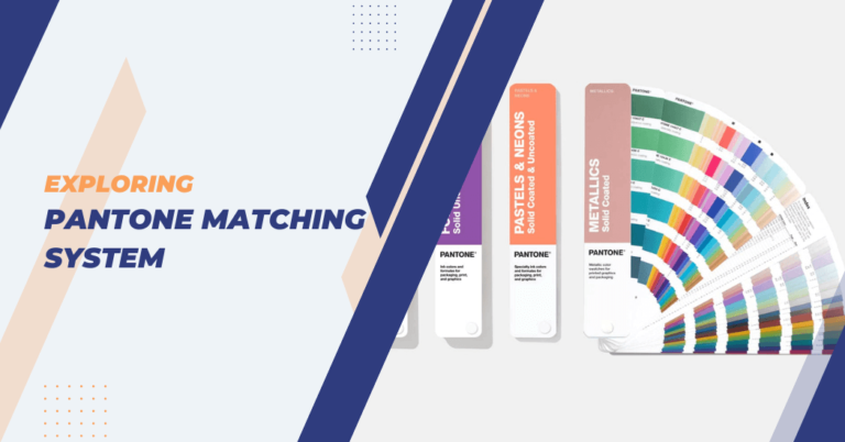
- Consider the overall design: Fonts should complement the overall packaging design and not clash with other visual elements such as pantone colors, shapes or images. A font that worked well on a previous packaging design may not necessarily work on a new one. Make sure to test and experiment with different font options before finalizing your design.
- Stay on trend: While it’s essential to stay true to your brand’s identity, incorporating current design trends can make your packaging stand out in a competitive market. Keep an eye on popular fonts being used in the industry and consider incorporating them into your design but also make sure they align with your brand’s image.
- Keep it simple: In most cases, less is more when it comes to packaging fonts. A cluttered design with multiple fonts can be overwhelming and distracting for consumers. Stick to a maximum of two or three fonts and use them consistently throughout your packaging design.
- Test and gather feedback: Before finalizing your packaging design, it’s crucial to test different font options with your target audience and gather their feedback. This can help identify any potential issues or preferences that can be addressed before the product goes into production. It’s also a good idea to get input from other professionals in the industry for a fresh perspective on your font choices.
By considering these key points, you can make informed decisions when selecting the best fonts for your packaging.
Tools and resources for choosing fonts for your packaging
- Font pairing tools: These online tools help you find complementary fonts that work well together for your packaging design, saving time and effort.
- Design inspiration websites: Websites such as Pinterest or Behance offer a wealth of creative ideas and inspiration for packaging designs using different fonts.
- Professional font libraries: Subscribing to professional font libraries can provide access to a wide variety of high-quality fonts that are suitable for packaging design.
- Fonts designed specifically for packaging: Some font designers create customized fonts specifically designed for packaging, taking into consideration factors such as readability and aesthetics.
- Graphic design software: Software such as Adobe Photoshop or Illustrator offers a vast selection of fonts to choose from and allows you to experiment with different styles and layouts before finalizing your design.
- Expert advice: Consulting with a professional graphic designer or marketing expert can provide valuable insights on font selection and its impact on packaging design.
With these tools and resources, you can confidently select the best fonts for your packaging and create visually appealing designs that effectively communicate your brand’s message.
Tips for choosing color schemes that complement font choices
| Tip | Explanation |
|---|---|
| Consider color psychology | Colors evoke different emotions and can significantly impact how your packaging is perceived. For example, blue can evoke feelings of trust and security, while yellow may convey optimism and happiness. Choose colors that align with the emotion you want your product to evoke, complementing the font style and brand personality. |
| Analyze your font’s style | The style of your font can help determine which colors will complement it best. A sleek, modern font might pair well with bold, contrasting colors, while a more traditional font could be complemented by classic, subdued hues. |
| Use color contrast | Contrast is key for readability and visual impact. Use a color scheme that ensures your text stands out against the background. High contrast between the font color and the packaging background can improve readability and attract attention. |
| Maintain brand consistency | Ensure the colors you choose are consistent with your brand’s existing color palette. This consistency helps reinforce your brand identity and assists customers in recognizing your products. |
| Test with your target audience | Before finalizing your packaging, it’s beneficial to test different color schemes with your target audience. This can provide insights into their preferences and how different color schemes might affect their perception of your product. |
| Consider printing constraints | It’s important to consider how your chosen colors will look once printed. Some colors might not translate well from digital to print, potentially affecting the overall look and feel of your packaging. Always test print your designs to ensure color accuracy. |
| Use high-quality images | If your packaging design includes images, make sure they are high-quality and complement the font and color scheme. Poor-quality images can distract from the overall design and take away from the impact of your chosen fonts and colors. |
| Keep it simple | As with font selection, less is often more when it comes to color schemes. Stick to a maximum of two or three colors for your packaging design to avoid overwhelming consumers and maintain a cohesive look. |
Budget considerations when selecting fonts and colors for packaging
When it comes to packaging design, budget is always a factor that needs to be taken into consideration.
Here are some key points to keep in mind when working with limited resources:
- Stick with standard fonts: While custom and unique fonts can make your packaging stand out, they can also come at a higher price. Stick with standard fonts that are readily available and affordable.
- Limit the number of colors: As mentioned earlier, using a limited color scheme can be beneficial for your packaging design. It not only helps maintain consistency and simplicity but also reduces printing costs.
- Choose open-source fonts: Open-source fonts are free to use and can provide a cost-effective option for small businesses or startups looking to save on font expenses.
- Consider alternate options: If you have your heart set on a particular font or color scheme but it’s not within your budget, consider looking for similar alternatives that are more affordable.
- Invest in high-quality printing: While it may seem like an added expense, investing in high-quality printing can make a significant difference in the overall look and feel of your packaging. It can also help ensure color accuracy and avoid any potential printing mishaps that could be costly in the long run.
Examining successful packaging designs and font choices
When it comes to packaging design, studying what has worked well for others can provide valuable insights and inspiration.
Here are a few examples of successful packaging designs with effective font choices:
- Coca-Cola: The iconic white cursive font used by Coca-Cola is instantly recognizable and has remained consistent throughout the brand’s history. It effectively conveys a sense of nostalgia and tradition, while also being easily readable and memorable.
- Apple: Apple’s sleek and minimalist packaging incorporates a simple sans-serif font that perfectly complements its clean design aesthetic. The use of subtle variations in font size and weight adds visual interest without overwhelming the overall design.
- Tiffany & Co.: Tiffany & Co.’s signature blue packaging is instantly associated with luxury and elegance. The use of a classic, serif font in white against the blue background creates a timeless and sophisticated look.
- Dove: Dove’s simple yet effective use of a bold sans-serif font on their packaging conveys a sense of trust and reliability, aligning with their brand values. The blue and white color scheme adds to the clean and calming aesthetic.
By examining these successful packaging designs and their font choices, we can see how font selection plays a crucial role in reinforcing brand identity and creating an impact on consumers.
FAQs – Packaging Fonts
Can I use multiple fonts on my packaging design?
Yes, but it’s advisable to limit yourself to two or three fonts to maintain a cohesive and harmonious design. Using too many fonts can create visual clutter and dilute your brand message.
Can I use free fonts for commercial packaging?
While many free fonts are available for commercial use, always check the license agreement to ensure you’re allowed to use them for your specific purposes. Some fonts may require attribution or have restrictions on commercial use.
How can I test if a font works well on my packaging?
After narrowing down your options, create mock-ups of your packaging with the selected fonts and review them with your team. Consider conducting focus group testing with your target audience to gather feedback on readability, emotional impact and brand alignment.
What should I do if my preferred font is too expensive?
Look for similar alternatives that fit your budget. Many fonts have similar characteristics and can serve as a cost-effective replacement without compromising the design integrity of your packaging.
Final Thoughts
The selection of fonts and colors for packaging design is a crucial aspect of creating visually appealing and effective designs. By following the tips mentioned above, considering budget constraints and staying true to your brand identity, you can create custom packaging that stands out on shelves and effectively communicates your brand’s message.
Remember to always test and seek feedback from your target audience to ensure your font and color choices resonate with them.


